The smartphone and tablet revolutions have been nothing short of a millennial miracle.
Despite being perfected just a few years ago, they have now replaced the laptop and desktop computers as the main electronic mediums for the modern man.
This isn’t an exaggeration, and entrepreneurs will do well to pay close attention to the recent statistics.
58 percent of completed online sales and more than half of all e-commerce traffic coming from mobile users.
With this much market domination, you’d think that business owners are scrambling to make sure that their websites are optimized for smartphones and tablets.
Surprisingly, many consider this practice a nuisance at best and simply leave their desktop version to handle all devices, which is a surefire recipe for disaster.
It’s simply not possible to own a successful online store without having an efficient mobile website for your customers.
The good news is that you don’t need to redesign all your pages from scratch. With just five tweaks to the layout, you can have a user-friendly e-commerce front that makes you stand out from the rest of the competition.
Let’s get to it, shall we?
Design essential 1: Less is more
Unlike a personal computer’s widescreen that allows you to fit in as much information as you can manage, a cell phone’s display size just can’t compete with this kind of real estate.
Some entrepreneurs are unable to come to terms with this limitation and feel like they must include everything that desktop users can see.
Ironically, this common concern hurts more than it helps.
By trying to cram everything into a tiny space, customers using a mobile device will be treated to a jumbled mess of small print and thumbnail photos. This forces them to utilize the dreaded zoom function.
If your website visitors aren’t able to comprehend something without zooming in, then it’s a telltale sign that you’ve put in too much.
A good example is Ubersuggest’s homepage. If you visit it, you’ll see how clear their message is.
Their offer and CTA can be seen readily by their audience.

Design essential 2: Menus are your friend
One way to counteract the lack of space is to make use of navigation tabs. A horizontal menu is not ideal, because cellphones are seldom held flat with both hands.
More appropriate is a drop-down or expanding the vertical menu. When a customer wants to find out more, he can simply click on a button and a list of links will appear.
Not only does this design utilizes the natural standing shape of most phones, but it is also a neat way to keep screen clutter to a minimum while still allowing visitors to view extra information whenever they want.
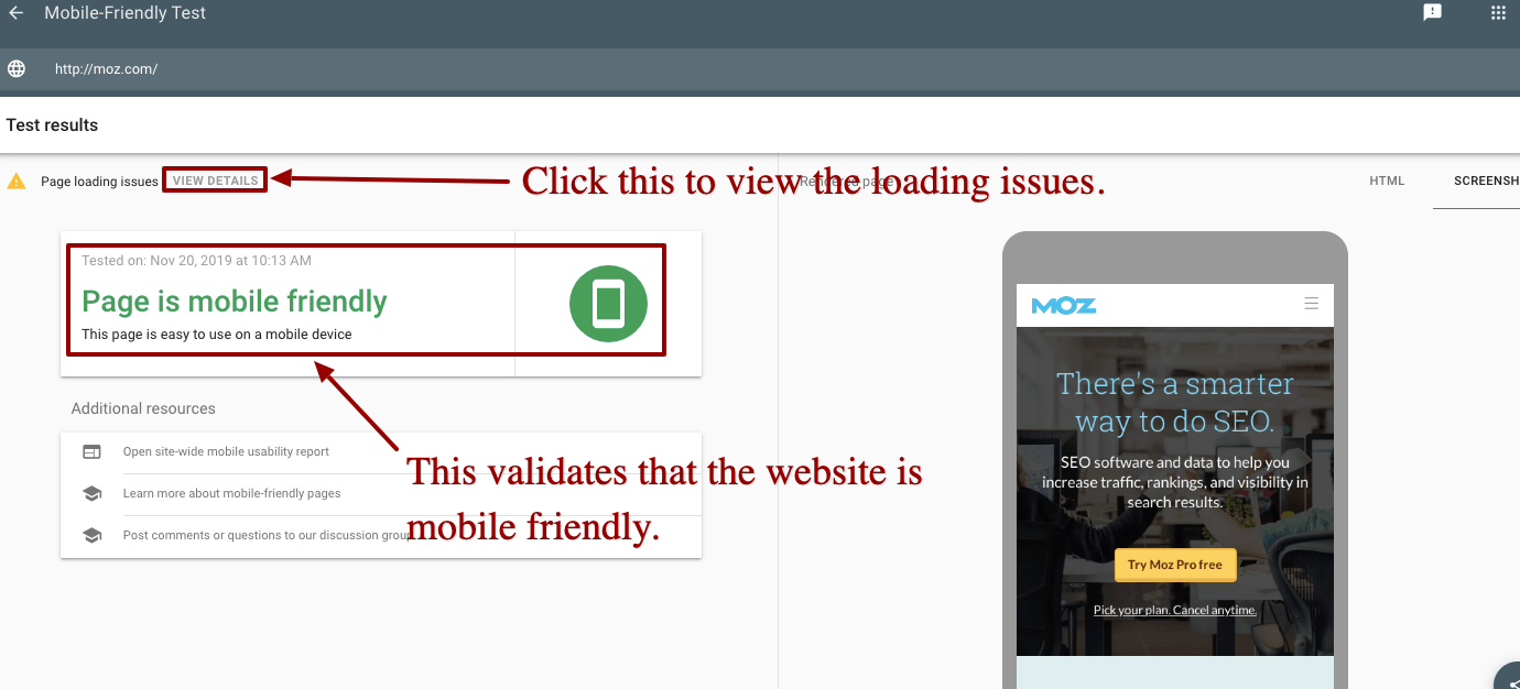
To ensure (to some extent) that your website is mobile-friendly, you can use Google’s Mobile-Friendly tester. I typed in moz.com to show you how the free tool works. This is what it came up with.

Pretty sweet, huh? If Google tells you that your website is mobile-friendly, then you know you’re on the right track.
Design essential 3: Large fonts and large photos
Less stuff onscreen means that whatever material is leftover should take up all of the space—everything that remains should make use of the area as best as possible. This is a natural offshoot to the first design essential.
What you’ll need to do is to use large font sizes and photos so that customers who land on your store don’t have to squint.
Your job is to make your visitors’ lives as easy as possible. When your site requires minimal scrolling and has maximum visibility, your clients will thank you for it.
On a side note, the kind of font you use also needs to be considered. Unless there’s a good reason, cursive and fancy styles of writing should be avoided.
Stick with a simple sans-serif font and you’ll be fine. Remember: customers aren’t there to admire the alphabet—they’re there to buy your stuff, and they can’t do that if they get easily distracted by your chosen calligraphy.
Design essential 4: Smart searches
Out of all the parts of an e-commerce website, the search bar is the most important. Customers will be zeroing in on what they want rather than scrolling mindlessly through your inventory.
The search function, therefore, needs to be as streamlined as it can possibly get. A small search box with the tiny font is an incredibly frustrating experience, but even worse is typing in a long string of words and ending up having to make a correction.
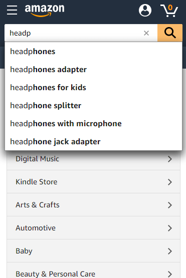
If you want to provide the best customer experience, then you’ll need a search box that is linked to your inventory and contains an autocomplete function.
By inputting a few letters, the entry is automatically narrowed down and filled in without too much typing involved. Amazon’s search bar does this quite well.

This is a small improvement that yields a massive amount of return.
Design essential 5: Fast checkouts
When a customer has made it to his online cart, you can be sure that he’s about to purchase an item. It becomes all the more baffling why approximately 60% of them suddenly bail out and refuse to complete the transaction.
The obvious reason for this sudden drop in conversions is a frustrating checkout process.
Amateur business websites ask a ton of irrelevant information. Worse, they may even require that the user goes through a lengthy sign-up routine before they can buy something.
Unless you went into e-commerce to collect emails and birthdates, putting roadblocks for your eagerly paying customers is clearly the wrong way to go.
To avoid this pitfall, always provide a guest option that allows purchases for one-time clients and only ask relevant details such as a delivery address and payment method. You also want to make sure that you have an automatic receipt capture for your data extraction.
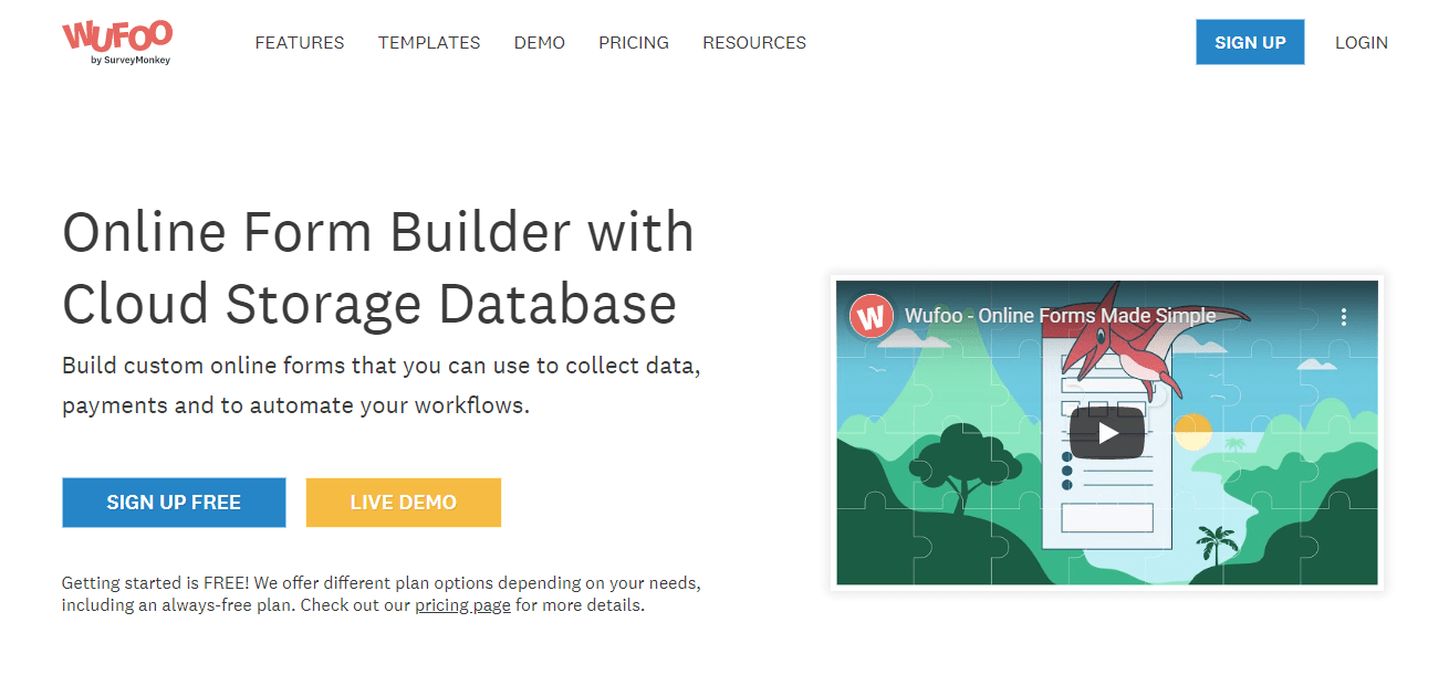
Everything else is optional and can be done later as a follow-up after they’ve bought your products. Websites such as Wufoo help you create simple and effective forms for your checkout cart.

Lastly, despite being no less dangerous than a desktop computer, there is still a common misconception that mobile devices are inherently risky. Therefore, you need to guarantee that your sales page is clearly encrypted and secure to avoid scaring anyone away.
Conclusion
It’s both an exciting and challenging time to be a business owner, especially with the rapid advancement of technology. If you don’t follow the latest trends, your models can quickly become outdated.
Desktops and laptops are still popular, but they’re quickly being eclipsed by mobile devices. It’s an extra chore to optimize your websites for these mediums, but the effort is worth it.
Don’t let the limitations of smartphones and tablets discourage you. Once you get into the habit of working with them, you’ll find out that there really was nothing worth fretting over.
Besides, the extra profits that you’ll inevitably receive certainly won’t dampen your spirits!


